11/18/2007

sorcerer guy (what a sales title)


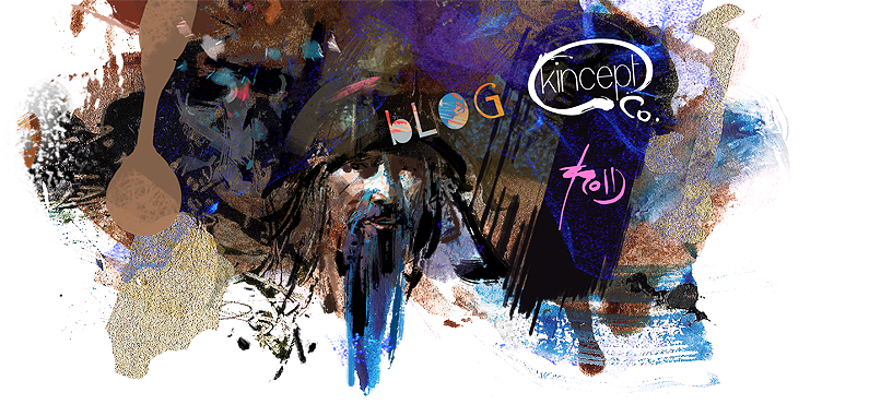
A couple of little touch ups.. the hand on the right was looking a little big to me, so I shrunk it.. I got rid of a couple more unwanted paint strokes, and I recropped slightly (again) because I felt the piece didn't need such space to be balanced.... oh.. and a signature :)

This is a presentable stage to me.. maybe I'll tighten it up in the future, but I'd thought I'd post it here for now.. cheers and thanks again guys for all your positive feedback!

sticking to my word pt. 4


..and a little bit more edge refinement... almost there..


..painting in the borders to fit the new canvas size..


.. so in my eyes at this point he looked too sophisticated to be cropped at an angle.. he's more of an experienced sorcerer, so he doesn't need an action packed dutch camera view (i'm communicating with myself).. rotate


...a sorcerer type guy casting a spell with some smoke underneath him.. (btw, I tend to look at things for a long time until I see something interesting.. this new layer took some time)


-coming back from my break- you know what.. I don't like what I'm seeing at this point, so I'll re-assess the painting.. I decide to duplicate the original abstract shape and play around with viewing it in different layer styles... here's what I ended up with - flip the canvas upside down and change the abstract to a soft light layer... because what I really see is...

sticking to my word pt. 3


now I think I can start painting and refining some of the details out a bit more... and also a needed break..


.phew.. got my light sources in there now... I'm kind of losing some of that local color.. Let me refine that a little bit more with another overlay layer..


and one more for the fill light.. this one I didn't want too much spill over between the other layers, so I double-clicked on the layer and dragged some of those arrows around to adjust the blending of the layer (for the other photoshop guys out there)..


one for the bigger picture of light sources...


after I got my general local colors roughed in, I decided to add a couple of new Linear Light layers - one for the general shadows..

sticking to my word pt. 2


..new layer: overlay - to get a better idea of what this guy's local colors are going to be.. at this stage, I tend to spend a lot of time referencing/experimenting with colors to see what works..


alright, so next I'll throw some lines on there to get a feel for what the shapes are going to be (it's not uncommon that I may use a couple of layers for this.. a rough and a cleanup.. sometimes I spend quite a bit of time on the drawing, but I was lazy today)


..and less hard edges..


...I think it needs more contrast at this point..


.. cropping in I can see a character in some of the shapes...

sticking to my word pt. 1


... and a hue/saturation pass.. because I just didn't feel right painting a red and turquoise painting that day.. there are some interesting shapes in there.. i think.. so onto the next step!

**the key here when I'm doing this for myself is to just a reminder that all I'm looking for is an interesting set of shapes..


Once I feel like I've created something that I feel has somewhat of a potential I'll bring it into photoshop and tweak edges even more using the smudge brush..


So here goes.. a step by step of a new piece.. I'll just jump right into it (for those of you reading this it goes from the bottom --> up). I started with a random set of scribbles in ArtRage. The good thing about the program I find is that there's a cleanliness of edge variation and color mixing that you don't get in photoshop..

11/08/2007

antonio mancini!


I just got his book off Amazon and now my artistic abilities have been humiliated.. in a good way :) So I had to do one more copy or else I'd forget everything I had ever learned about art.

The other thing I have to do soon is another piece of my own.. with process images (i haven't forgotten)..