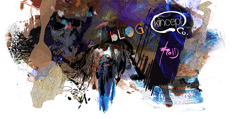

A couple of little touch ups.. the hand on the right was looking a little big to me, so I shrunk it.. I got rid of a couple more unwanted paint strokes, and I recropped slightly (again) because I felt the piece didn't need such space to be balanced.... oh.. and a signature :)
This is a presentable stage to me.. maybe I'll tighten it up in the future, but I'd thought I'd post it here for now.. cheers and thanks again guys for all your positive feedback!
28 comments:
you got some interesting
colors interacting
with each other and the values
are great, looks very cinematic.
I really enjoyed the process too,
looking forward for more.
great body language on the sorcerer !
Hey Kinman,
What a great write up.
Thanks for doing this. Colors are so yummy.
Brilliant...absolutely love this...process is fantastic to see.
good to see. although i didn't understand all the computer lingo, it was very interesting to see how you work!
sweet demo mang. nice to see your process, going to try this one day.
Thanks, Kinman!
finally, i can embrace the blog technology.
Nice dude!! I need to incorporate that artrage more often!
This is absolutely the best Photoshop tutorial I've ever seen. It really runs parallel to my train of thinking and process, however I haven't been able to refine the technique into something that's functional or practical yet.
This really clarifies a few things that I've been lacking in my process.
THANK YOU!
This step by step piece is the coolest thing ever.
It feels like dreams I have.
It looks like music!
Inspirational! :)
Hey Kinman, nice work and process! Thanks for sharing that! Have a Happy Thanksgiving!
oh man, too cool.
thanks for the tutorial, i have to try this now!
you deserve some ice cream for this.
finally a kinman demo!....love the colors too.
nice one man. great to see the process.
thanks for sharing. it especially interesting how you manipulate the edges in ps.
It reminds me of my Originality in Design class. So cool man!
Great colors! Looks so theatrical.
Love it! Atmospere, shapes, texture everything came together.
wow kinman. that's amazing. and i totally saw the same thing in your scribble. :)
I like that you integrated a simple program like artrage into your creative process. Sometimes we are so bogged down by the infinite amount of digital brushes we can use in photoshop thats its nice to set limits for ourselves. Love how the piece turned out.
very nice, Kinman! love the bold colors---thanks for sharing!
I'm already working on it.
hey kinman, fun stuff. if you still want the website redesign drop me a line at gmail.com, name is same as the handle I'm using here. your current website's making my antivirus wig, so I couldn't fetch your email from there to directly contact you.
Yes, a definite classic! You also made a great decision cropping tighter.
Hey Kinman thanks for stopping by. Sorry we didn't get a chance to go landscape painting last week. Maybe when the weather is better we can schedule something.
I love the way this piece unfolds through its various stages. Thank you for sharing this with us. Beautiful work.
Best--
Rick
Great steps great work!
thank your for sharing this approach. you've got great colors!
Post a Comment